3カラムからの変更
3カラムのレスポンシブは、前章の「2カラムレイアウトのレスポンシブ化」のfloatを使用したパターンでは難しい場合があります。
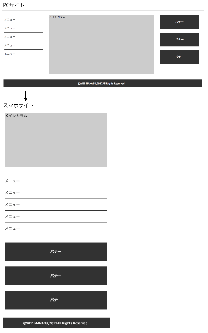
PCサイトで中央にメインカラム、両端にナビやバナーなどのサブカラムがある場合、スマホでは、メインカラム → サブカラム → サブカラムといった順に並べたいことが多いと思います。
このような場合は、PCサイトで、position: absolute; を使うと自由にレイアウトを作ることができます。
ポイントは、メインカラムまたは一番高さがあるカラムには、positionを設定しないことです。
position: absolute; は、親要素からは認識できない要素となり、親要素が高さを確保することができません。
結果、footerなどの下のブロックが重なってしまいます。
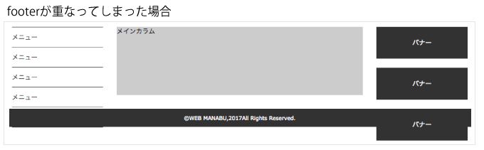
下記のサンプルは、左にナビ、右にバナーエリアを設置した場合です。
メインカラムには、サブカラムより高くなるようにheightを指定していますが、通常はheight指定をしないようにしましょう。
もし、メインカラムがサブカラムより高さが足りない場合は、メインカラムにmargin-bottomやpadding-bottomで調整するほうが良いでしょう。
今回も「5章. レスポンシブサイトの設計方法」で紹介した3つのパターンのCSSで解説します。
下記は、共通のHTMLです。
<div class="wrap">
  <div class="main">メインカラム</div>
  <ul class="side-menu">
    <li><a href="#">メニュー</a></li>
    <li><a href="#">メニュー</a></li>
    <li><a href="#">メニュー</a></li>
    <li><a href="#">メニュー</a></li>
    <li><a href="#">メニュー</a></li>
  </ul>
  <aside class="banner-area">
    <div><a href="#">バナー</a></div>
    <div><a href="#">バナー</a></div>
    <div><a href="#">バナー</a></div>
  </aside>
</div>
<footer><p><small>©WEB MANABU,2017All Rights Reserved.</small></p></footer>
pc → スマホ(pcを継承)の場合
下記は、PCサイトからCSSを指定。スマホサイトはメディアクエリを使いPCサイトのCSSを継承して指定しています。
pc側で、設定したpositionをスマホ側で position: static; で解除しています。
/* pc 768px以上 */
.wrap{
  /* サイドメニューとバナーエリアの基点に設定 */
  position: relative;
  width: 1000px;
  margin-left: auto;
  margin-right: auto;
  margin-bottom: 30px;
}

/* メインカラム */
.main{
  width: 540px;
  /* サンプル用に高さを指定 */
  height: 300px;
  margin-left: 230px;
  background-color: #ccc;
}

/* サイドメニュー */
.side-menu{
  /* 左端に設置 */
  position: absolute;
  top: 0;
  left: 0;
  width: 200px;
  border-top: 1px solid #333;
}
.side-menu li a{
  display: block;
  height: 44px;
  line-height: 44px;
  border-bottom: 1px solid #333;
  text-decoration: none;
  color: #333;
}

/* バナーエリア */
.banner-area{
  /* 右端に設置 */
  position: absolute;
  top: 0;
  right: 0;
  width: 200px;
}
.banner-area div{
  margin-bottom: 20px;
}
.banner-area div a{
  display: block;
  height: 70px;
  line-height: 70px;
  background-color: #333;
  text-decoration: none;
  text-align: center;
  color: #fff;
}

/* footer */
footer{
  height: 40px;
  line-height: 40px;
  background-color: #333;
  text-align: center;
  color: #fff;
}

/* スマホ 767px以下 */
@media only screen and (max-width: 767px) {
  .wrap{
    /* position: relative;を解除 */
    position: static;
    width: 90%;
  }

  /* メインカラム */
  .main{
    width: 100%;
    /* サンプル用に高さを指定 */
    height: 200px;
    margin-left: 0;
    margin-bottom: 30px;
  }

  /* サイドメニュー */
  .side-menu{
    /* position: absolute;を解除 */
    position: static;
    width: 100%;
    margin-bottom: 30px;
  }

  /* バナーエリア */
  .banner-area{
    /* position: absolute;を解除 */
    position: static;
    width: 100%;
  }
}
スマホ → pc(スマホを継承)の場合
下記は、スマホサイトからCSSを指定。PCサイトはメディアクエリを使いスマホサイトのCSSを継承して指定しています。
pc側でサイドメニューとバナーエリアに position: absolute; を指定し、両端に配置しました。
wrapで、position: relative; を指定し、2つのカラムの位置の基点にしています。
/* スマホ 767px以下 */
.wrap{
  width: 90%;
  margin-left: auto;
  margin-right: auto;
  margin-bottom: 30px;
}

/* メインカラム */
.main{
  /* サンプル用に高さを指定 */
  height: 200px;
  background-color: #ccc;
  margin-bottom: 30px;
}

/* サイドメニュー */
.side-menu{
  margin-bottom: 30px;
  border-top: 1px solid #333;
}
.side-menu li a{
  display: block;
  height: 44px;
  line-height: 44px;
  border-bottom: 1px solid #333;
  text-decoration: none;
  color: #333;
}

/* バナーエリア */
.banner-area div{
  margin-bottom: 20px;
}
.banner-area div a{
  display: block;
  height: 70px;
  line-height: 70px;
  background-color: #333;
  text-decoration: none;
  text-align: center;
  color: #fff;
}

/* footer */
footer{
  height: 40px;
  line-height: 40px;
  background-color: #333;
  text-align: center;
  color: #fff;
}

/* pc 768px以上 */
@media only screen and (min-width: 768px), print {
  .wrap{
    /* サイドメニューとバナーエリアの基点に設定 */
    position: relative;
    width: 1000px;
  }

  /* メインカラム */
  .main{
    width: 540px;
    /* サンプル用に高さを指定 */
    height: 300px;
    margin-bottom: 0;
    margin-left: 230px;
  }

  /* サイドメニュー */
  .side-menu{
    /* 左端に設置 */
    position: absolute;
    top: 0;
    left: 0;
    width: 200px;
    margin-bottom: 0;
  }

  /* バナーエリア */
  .banner-area{
    /* 右端に設置 */
    position: absolute;
    top: 0;
    right: 0;
    width: 200px;
  }
}
pc、スマホを別々に指定
下記は、pcサイトとスマホサイトのCSSを別々にメディアクエリで指定した場合です。
/* スマホ 767px以下 */
@media only screen and (max-width: 767px){
  .wrap{
    width: 90%;
    margin-left: auto;
    margin-right: auto;
    margin-bottom: 30px;
  }

  /* メインカラム */
  .main{
    /* サンプル用に高さを指定 */
    height: 200px;
    background-color: #ccc;
    margin-bottom: 30px;
  }

  /* サイドメニュー */
  .side-menu{
    margin-bottom: 30px;
    border-top: 1px solid #333;
  }
  .side-menu li a{
    display: block;
    height: 44px;
    line-height: 44px;
    border-bottom: 1px solid #333;
    text-decoration: none;
    color: #333;
  }

  /* バナーエリア */
  .banner-area div{
    margin-bottom: 20px;
  }
  .banner-area div a{
    display: block;
    height: 70px;
    line-height: 70px;
    background-color: #333;
    text-decoration: none;
    text-align: center;
    color: #fff;
  }

  /* footer */
  footer{
    height: 40px;
    line-height: 40px;
    background-color: #333;
    text-align: center;
    color: #fff;
  }
}

/* pc 768px以上 */
@media only screen and (min-width: 768px), print {
  .wrap{
    /* サイドメニューとバナーエリアの基点に設定 */
    position: relative;
    width: 1000px;
    margin-left: auto;
    margin-right: auto;
    margin-bottom: 30px;
  }

  /* メインカラム */
  .main{
    width: 540px;
    /* サンプル用に高さを指定 */
    height: 300px;
    margin-left: 230px;
    background-color: #ccc;
  }

  /* サイドメニュー */
  .side-menu{
    /* 左端に設置 */
    position: absolute;
    top: 0;
    left: 0;
    width: 200px;
    border-top: 1px solid #333;
  }
  .side-menu li a{
    display: block;
    height: 44px;
    line-height: 44px;
    border-bottom: 1px solid #333;
    text-decoration: none;
    color: #333;
  }

  /* バナーエリア */
  .banner-area{
    /* 右端に設置 */
    position: absolute;
    top: 0;
    right: 0;
    width: 200px;
  }
  .banner-area div{
    margin-bottom: 20px;
  }
  .banner-area div a{
    display: block;
    height: 70px;
    line-height: 70px;
    background-color: #333;
    text-decoration: none;
    text-align: center;
    color: #fff;
  }

  /* footer */
  footer{
    height: 40px;
    line-height: 40px;
    background-color: #333;
    text-align: center;
    color: #fff;
  }
}